Block
Rendering is based on a hierarchy of block objects. The following types of blocks are available:
stack(container)itemstack(container)dock(container)grid(container)table(container)canvas(container)imagetextshapecomponentstyle
Block containers may include other blocks (usually in the Items property). To create markup, you must describe the blocks and their properties.
A layer always starts with a description of the BlockRoot:
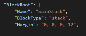
Block Properties
Standard JSON properties describe the block.
Data Types
| Name | Description | Example |
|---|---|---|
string |
String value. | "text" |
int |
Numeric value. | 10 |
bool |
Boolean value (true, false). |
false |
color |
Color value (hex code). | "#FF15AB18" |
List<object> |
Array of objects. | [{ "BlockType": "image" }, { "BlockType": "text" }] |
Dictionary<string, object> |
Key-value pairs. | "Key1": "Value1", "Key2": "Value2" |
object |
Universal type (can be string, bool, int, etc). | - |
Common Properties
The following properties apply to most block types.
| Property | Type | Description |
|---|---|---|
BlockType |
string |
The type of the block. |
Name |
string |
Unique name of the block. |
RenderIf |
bool |
Condition to render the block. |
RenderForce |
bool |
Forces rendering even if conditions are not met. |
Opacity |
int |
Opacity level (0-100). |
Width |
int / string |
Width in pixels. Supports string values like "*" or "auto". |
Height |
int / string |
Height in pixels. Supports string values like "*" or "auto". |
MinWidth |
int |
Minimum width in pixels. |
MinHeight |
int |
Minimum height in pixels. |
MaxWidth |
int |
Maximum width in pixels. |
MaxHeight |
int |
Maximum height in pixels. |
WidthPercent |
int |
Percentage (0-100) of the parent block's available width. 100 equals StretchWidth: true. |
HeightPercent |
int |
Percentage (0-100) of the parent block's available height. 100 equals StretchHeight: true. |
StretchWidth |
bool |
Fill all available width. |
StretchHeight |
bool |
Fill all available height. |
HorizontalAlignment |
enum |
Alignment options: Left, Right, Center. |
VerticalAlignment |
enum |
Alignment options: Top, Center, Bottom. |
Margin |
string |
Margin values. Single ("4"), two ("4, 8"), or four ("4, 8, 12, 16") values supported. |
MarginLeft |
int |
Left margin in pixels. |
MarginTop |
int |
Top margin in pixels. |
MarginRight |
int |
Right margin in pixels. |
MarginBottom |
int |
Bottom margin in pixels. |
Padding |
string |
Padding values (similar to Margin). |
PaddingLeft |
int |
Left padding in pixels. |
PaddingTop |
int |
Top padding in pixels. |
PaddingRight |
int |
Right padding in pixels. |
PaddingBottom |
int |
Bottom padding in pixels. |
Background |
color |
Background color. |
BackgroundImage |
string |
Path to the background image. |
DefaultBackgroundImage |
string |
Default image path used if retrieving the BackgroundImage fails. |
UseBackgroundCrop |
bool |
Whether the background image should be cropped. |
BackgroundImageOpacity |
int |
Opacity of the background image (0-100). |
BackgroundImageFitMode |
enum |
Background image fit mode. Values: Stretch (default), Cover (scale and crop overflow), Contain (scale to fit, may leave bars), None (original size). Respects HorizontalAlignment (Left/Center/Right) and VerticalAlignment (Top/Center/Bottom). Backwards compatibility: UseBackgroundCrop: true with no BackgroundImageFitMode is treated as Cover. |
BorderRadius |
int / string |
Rounds the corners of the block (background, padding area and nested blocks), in pixels. One value for all corners (12) or four values in the order top-left, top-right, bottom-right, bottom-left ("12, 0, 12, 0"). Added in 0.9.9. |
BorderRadiusTL |
int |
Top-left corner radius. Has priority over BorderRadius. Added in 0.9.9. |
BorderRadiusTR |
int |
Top-right corner radius. Has priority over BorderRadius. Added in 0.9.9. |
BorderRadiusBR |
int |
Bottom-right corner radius. Has priority over BorderRadius. Added in 0.9.9. |
BorderRadiusBL |
int |
Bottom-left corner radius. Has priority over BorderRadius. Added in 0.9.9. |
GridRow |
int |
Row number (if the block is a child of a grid). |
GridCol |
int |
Column number (if the block is a child of a grid). |
PositionX |
int |
X position (if the block is a child of a canvas). |
PositionY |
int |
Y position (if the block is a child of a canvas). |
PositionZ |
int |
Z-index for child blocks of stack, canvas, and dock (limited support). |
PlotPosition |
PlotPositionOptions |
Places a child block of a canvas at a data point of a chart instead of PositionX and PositionY, for example a value label above a bar or a name at the end of a line. Added in 0.9.9. |
Colorize |
ColorizeOptions |
Colorizes the final block image using a specific color. |
ColorizeBackground |
ColorizeOptions |
Colorizes the background of the block using a specific color. |
Triggers |
List<TriggerItem> |
Triggers for properties. |
Source |
object |
Data source (text, image, or collection path). |
Vars |
Dictionary |
Local block variables. Inherited hierarchically and overrides higher-level variables. |
Items |
List<Block> |
Array of nested blocks (available for block containers). |
FontName |
string |
Font name (text block only). Substituted into TextOptions. |
FontSize |
string |
Font size (text block only). Substituted into TextOptions. |
Foreground |
color |
Text color (text block only). Substituted into TextOptions. |
Orientation |
enum |
Horizontal or Vertical. Available for stack, dock, itemstack. |
Spacing |
int |
Space between nested blocks. Available for stack, dock, itemstack. |
Components |
List<Block> |
Defines components available for all nested blocks. |
Styles |
List<Block> |
Defines styles available for all nested blocks. |
Property Notes
- Items: Applies to
stack,dock,grid, andcanvas. - Common Properties: For convenience, the most common properties (
FontName,Orientation, etc) that are located in block options are placed in the block itself too. You can use them both ways, but the block properties have higher priority than the option properties. - Source: Duplicates specific properties (like
ImagePath,Text) and has higher priority. - Dimensions:
WidthandHeightdefault to0, meaning the engine calculates size based on content. Use"*"to fill available space. - BorderRadius: In
imageblocks the picture itself is rounded too, so an image withPadding(for example a flag) keeps rounded corners. Radii larger than the block are reduced to fit: a very large value gives a pill shape, half the side of a square block gives a circle. - PlotPosition:
XandYare data values.Scale(see ScaleOptions) andAreaWidth,AreaHeight(size of the chart shapes in pixels) define the chart.AnchorX(Left,Center,Right) andAnchorY(Top,Center,Bottom) choose which point of the block sits on the data point; both default toCenter.OffsetXandOffsetYshift the block in pixels. WhenX,Yor the area size is missing,PositionXandPositionYare used.
Examples
An example of a simple block description:
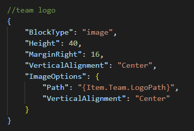
A layer can contain only one root block, specified as an object for the BlockRoot property:
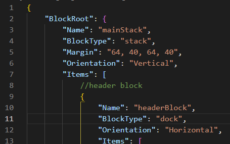
It is recommended to choose stack, dock, or grid as the root block.